
TL;DR · resumen ejecutivo
¿Qué vas a encontrar en este artículo?
Your landing page doesn’t convert. And every day that it doesn’t, you’re burning budget on traffic that escapes through a design that hinders more than it sells. Most visitors come to your page with no intention of buying. But that’s everyone’s reality. The difference is in who knows how to convert that cold traffic into buying decisions. In this guide we show you the landing page design...
Your landing page doesn’t convert. And every day that it doesn’t, you’re burning budget on traffic that escapes through a design that hinders more than it sells. Most visitors come to your page with no intention of buying. But that’s everyone’s reality. The difference is in who knows how to convert that cold traffic into buying decisions. In this guide we show you the landing page design principles that drive that metric. No decorative theory. Just what works.
Según Figma (2025), el 90% de los sitios web a nivel global ya implementan diseño responsive, logrando un 11% más de conversiones frente a sitios no adaptados. — Fuente: Figma Web Design Statistics, 2025
Here you won’t find generic advice about “creating memorable experiences” or “connecting emotionally with your audience”. That sounds good in presentations. Not in your bottom line. At CRONUTS.DIGITAL we get down to what really makes an impact on conversion.
Presupuesto para tu landing page →
1. The value proposition must be seen in 3 seconds
Your visitor doesn’t read. He scans. And decides in less time than it takes you to blink.
If your value proposition is not visible, clear and differentiated in the first 3 seconds, you’ve already lost. Half of your traffic will leave before scrolling. The fundamental principle of effective landing page design is immediate clarity.
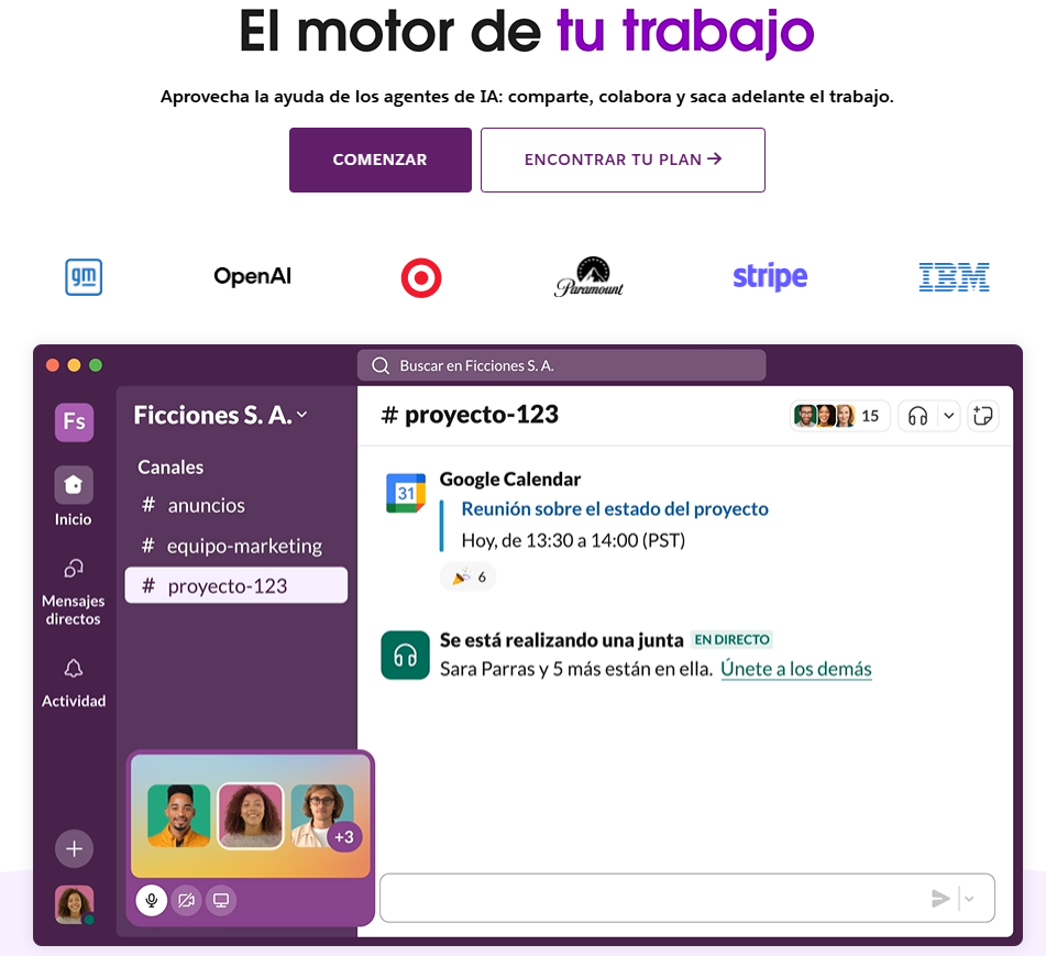
Real example: Slack doesn’t say “business communication tool”. It says “share, collaborate and get work done”. Clear value. Visible differentiation. Instant decision.
Your headline should answer: What’s in it for me? Why here? Why now?
But here’s the problem no one tells you: most headlines are company-centric, not customer-centric. “We are leaders in…” “We offer innovative solutions…” “With over 20 years of experience…”. Your visitor cares zero about your expertise if they don’t see how it solves their problem.
The formula that works: [specific result] + [for whom] + [without the main obstacle].
Example: “increase your turnover by 40% without hiring more equipment” converts more than “strategic consulting for growing companies”.
Context also matters. If you come from an ad that promises to “double leads in 30 days”, your headline should echo that promise. Consistency between the ad and the landing is conversion. Disconnection is friction.
2. One goal, one action, zero distractions.
Every element on your landing page must serve the conversion. If it doesn’t push towards the CTA, it’s subtracting.
Converting pages eliminates options. No navigation menu. No external links. No secondary buttons that dilute the main decision. This is one of the most overlooked and most profitable landing page design principles.
Key fact: landing pages with a single CTA convert 371% more than those with multiple options(Wordstream).
Your visitor doesn’t need to explore. He needs to decide. Make it easy for him or your competition will.
The opportunity cost of distractions: every blog link, every “learn more about us”, every social media button is an exit. And every exit is a conversion that doesn’t happen.
The exception: long pages for complex or high-ticket products may include internal navigation (anchors) that lead to specific sections within the same page. But never outwards.
3. Visual design directs the eye, not decorates it.
Design is not aesthetic. It is functional. Every color, contrast and white space must lead the visitor to conversion.
High-performing landing page design principles use visual hierarchy: the eye should go from the headline to the benefit, from the benefit to the social proof, and from there to the CTA. No friction. No hesitation.
Applied technique: use white space to isolate critical elements. The CTA must breathe. If it is surrounded by noise, it becomes invisible.
Contrasting colors on buttons increase conversions. But contrast isn’t just color. It’s size. It’s position. It’s the strategic use of negative space to make what’s important impossible to ignore.
Common mistakes that kill conversion:
- Buttons of the same size as secondary elements.
- CTAs in colors that “match nicely” with the palette but don’t stand out.
- Too many elements competing for attention on the first screen.
- Decorative images that do not support the message or direct the eye.
The F and Z pattern: eye-tracking studies show that we read in predictable patterns. The F pattern for dense text, the Z pattern for pages with less text. Design your hierarchy following these natural patterns.
Place your value proposition in the upper left corner. Your main CTA at the end point of the pattern (upper right for Z, lower left after the F path).
4. Loading speed is not technical, it is conversion.
Every second of delay in loading costs 7% of conversions. If your landing page takes more than 3 seconds, you are giving away leads to your competitors.
Landing page design that converts optimizes images, eliminates unnecessary scripts and prioritizes speed over eye candy. It doesn’t matter how pretty your page is if no one waits to see it.
Direct action: compress images to WebP. Use lazy loading. Remove everything that doesn’t convert. Speed is conversion, period.
Amazon calculated that every 100ms of latency costs them 1% of sales. You’re not at Amazon level, but the principle is the same: speed is not a technical detail for your IT team. It’s a growth lever.
The silent enemies of speed:
- Third-party scripts (especially excessive analytics, heavy chatbots, poorly implemented retargeting pixels).
- Unoptimized images (that 5MB hero image that “looks amazing”).
- Custom web fonts loading 6 variations you never use.
- Complex animations that look great on your Mac but drag on mid-range mobiles.
Cuánto cuesta una web profesional →
5. Good copywriting sells more than design
Perfect design with mediocre copy does not convert. A basic design with sharp copy destroys metrics.
The principles of effective landing page design put copy at the center. Each line should answer objections, show tangible benefits and push toward action. No frills. No corporate mumbo jumbo.
Proven formula: problem + agitation + solution + test + CTA.
Example: “Your website does not convert. It costs money every day. We diagnose what’s wrong and correct it. +120 businesses scaled. Activate your diagnosis now.”
That sells. “End-to-end solutions for your digital transformation” does not.
Effective copy is specific. It does not talk about “increased sales”. It talks about “43% more turnover in the first quarter”. It does not promise “improved results”. It shows “12 to 89 qualified leads per month without increasing budget”.
The anatomy of copy that converts:
- Headline: the most desirable result for your avatar in 10 words or less
- Subtitling: eliminates the main objection or adds specificity
- Benefit bullets: no features. Consequences. Each bullet answers “and what does that mean for me?”
- Objections handling: anticipate the “yes, but…” your visitor is thinking.
- Real urgency: not fake (“offer ends tonight”). Real (“we only accept 5 projects per month and we already have 3”).
The active voice dominates: “multiply your leads” converts more than “your leads will be multiplied”. There is no room for passive voice when you sell. The action is taken by the customer, it doesn’t happen to him.
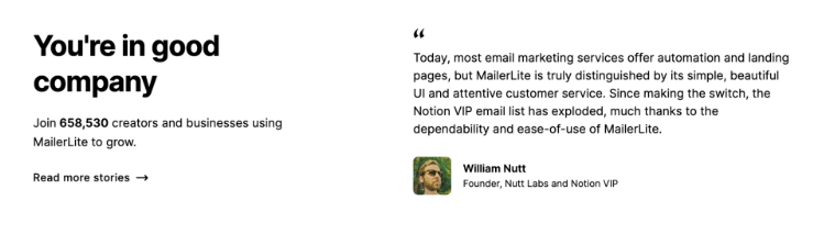
6. Social proof must be specific and verifiable.
“Satisfied customers” convinces no one. Social proof works when it is concrete, measurable and credible.
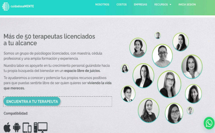
Testimonials with full name, photo, company and specific result convert. Recognizable brand logos convert. Accurate numbers of clients, projects or results convert. Everything else is decoration that the visitor ignores.
If your social proof looks made up, it’s worse than not having it. Credibility is not restored.
The hierarchy of social proof (from least to most powerful):
- Number of clients without context (“More than 500 companies trust us”).
- Logos of well-known brands (works only if they are really recognizable).
- Testimonials with name and photo (minimum viable).
- Testimonials with measurable results (“We increased turnover by 67% in 4 months” – Juan Pérez, CEO of TechCorp).
- Video testimonials (maximum credibility, maximum conversion).
- Complete case studies with before/after and process.
Formatting matters: a 3-paragraph testimonial is not readable. Extract the most powerful sentence. Put it in large text. The rest in smaller text or as optional expansion.
Strategic placement: just before the main CTA. When the visitor is considering action, the final push is to see that others have already done it and it worked.
Network flags that destroy credibility:
- Too perfect testimonials (“They are the best! They changed my life! 10/10!”).
- Stock photos that look like stock photos.
- Impossible results without context (“From 0 to 1 million in one week!”).
- Only initials or first name without anything else.
If you don’t have testimonials yet, use verifiable performance data. “1,247 companies use our tool” with link to public directory. “4.8/5 rating on G2 with 234 reviews” with direct link to profile.
7. The forms should ask for the minimum necessary
Each field you add to your form reduces conversions by 5-10%. If you ask for first name, last name, email, phone, company, position and budget, you are killing leads.
High conversion landing page design reduces friction. If you only need email to start the relationship, ask for that. The rest can come later.
Proven test: reducing from 11 to 4 fields increased conversions by 120% on Imagescape.
Information that you will not use immediately should not be in the form. Each field is a filter. Make sure it is worthwhile.
The critical question: do I need this data to take the next step or do I just want it to complete my CRM?
If it’s the latter, remove it. Your CRM can wait. Your conversion can’t.
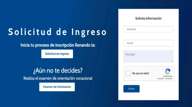
Fields that you almost never need on first contact:
- Last name (the first name is enough to personalize)
- Telephone (unless it is for an immediate call)
- Physical address (are you really going to mail anything before closing?)
- Position/Position (you can ask later if you qualify)
- Company size (same)
The exception for high ticket products: if you sell 50k+ services or have limited capacity, a longer form may be your filter. You want qualified leads, not volume. In that case, each additional field qualifies better but reduces volume. It’s a strategic decision, not a flaw.
8. The CTA is not a button, it is a decision.
“Send”, “Subscribe”, “Download” are dead CTAs. They do not sell of consequence. They don’t show value.
CTAs that convert speak in the first person, show the immediate benefit and eliminate risk. They should be seen as the obvious decision, not a request.
Examples that work:
- “I want my free diagnosis”
- “Activate my growth now”
- “See why my website doesn’t sell”
- “Access the method”
- “Start my climb.”
Color matters (high contrast), position matters (above the fold + repeated), but CTA copy is the most powerful lever.
The anatomy of a CTA that converts:
- Strong action verb: Activate, Access, Start, Discover, Achieve
- Clear benefit: not “download PDF” but “Get the guide we use for 10X customers”.
- Elimination of risk: “Free”, “No card”, “Cancel anytime”, “0 commitment”.
- First person when possible: “I want my…” converts rather than “Get your…”
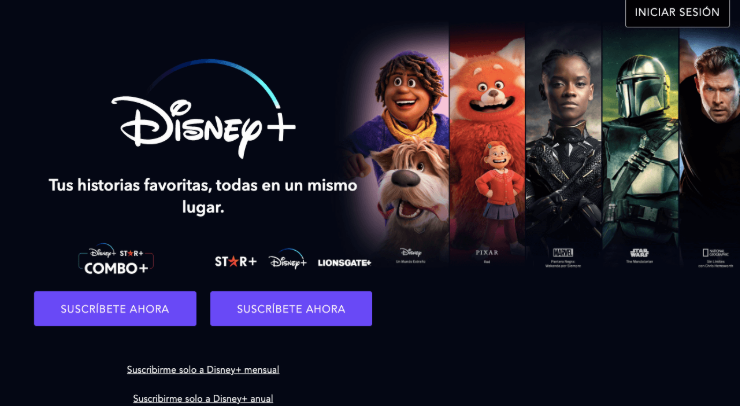
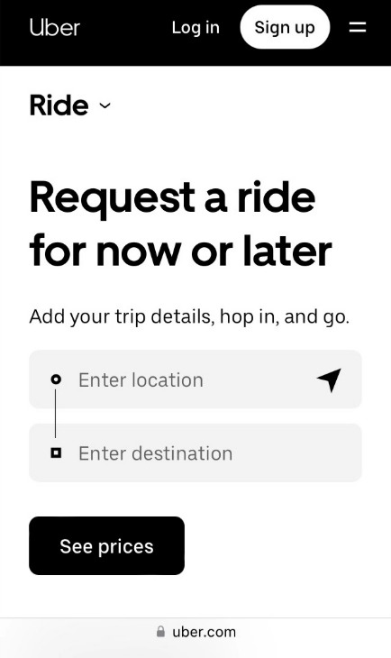
9. Responsive design is not optional, it is a priority.
Most web traffic comes from mobile. If your landing page is not optimized for small screens, you are losing more than half of your potential conversions.
Modern landing page design principles prioritize mobile-first. Big buttons, concise copy, simplified forms, ultra-fast loading speed. What works on desktop can be a disaster on mobile.
Test on mobile: use your thumb. If you can’t easily click on the CTA or fill out the form with one hand, redesign.
But responsive is not just about “looking good on mobile”. It’s rethinking the whole experience for a 6-inch screen where the context of use is radically different.
Critical differences mobile vs. desktop:
- Attention context: on desktop, your visitor is probably seated, focused. On mobile, they are on the subway, waiting for coffee, with a thousand distractions. Your message must be more direct.
- Connection speed: although 5G exists, much of your mobile traffic is on 4G or worse. Mobile speed optimization is non-negotiable.
- Touch interaction: buttons should be at least 44×44 pixels. Form fields should be large. Spacing between clickable elements should avoid accidental touches.
- Vertical orientation: design with vertical scroll in mind, not complex horizontal layouts.
Elements that change radically in mobile:
- The hero: on desktop you can have headline + subtitle + image + CTA on the first screen. On mobile, prioritize: Headline + CTA. The rest can wait for one or two scrolls.
- Forms: on desktop, two columns can work. On mobile, only one column. Each field on its own line. Keyboard optimized for each type of field (numeric for phone, email for mail).
- Navigation: if your landing page has any internal navigation, on mobile it should collapse into a hamburger menu or sticky footer.
- Images: it’s not just about scaling them. It’s about choosing images that work vertically. An epic horizontal photo can lose all its impact when compressed on mobile.
El mercado global de diseño web alcanzó los 55.270 millones de dólares en 2025, con una proyección a 124.640 millones para 2033 (Fortune Business Insights, 2025). — Fuente: Fortune Business Insights, 2025
10. Continuous testing separates growth from stagnation
No landing page is finished. And this is what we want to make clear in the last of our principles of landing page design that converts: the ones that convert today may not work tomorrow. The best landing page designs are the result of constant iteration based on real data.
A/B testing on headlines, CTAs, colors, images, copy length. Each change shows you what drives conversion and what is just decoration.
Testing priority:
- Headline and value proposition
- CTA (copy, color, position)
- Form length
- Social proof and guarantees
- Hero images
- Total page length (short vs. long)
Don’t guess. Test. The difference between 2% and 8% conversion is in the details you measure and optimize.
The testing framework that works:
- Clear hypothesis: “I believe that changing the headline from X to Y will increase conversions because Z”.
- One variable at a time: if you change headline, CTA and colors simultaneously, you’ll never know what worked.
- Sufficient volume: you need at least 100 conversions per variant for statistical significance.
- Adequate duration: minimum one week, ideally two, to capture variability by weekday
Testing tools by level:
- Getting Started: Google Optimize (free, integrated with Analytics)
- Mid-level: Optimizely, VWO
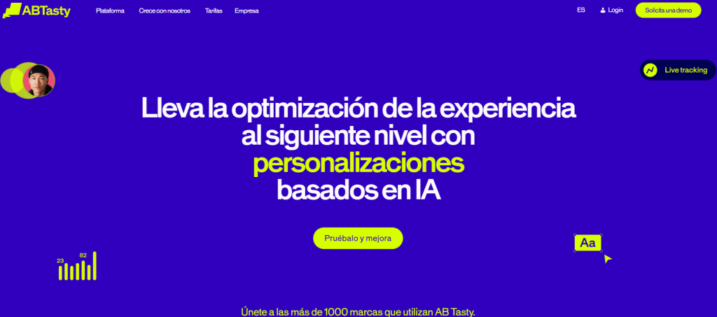
- High volume: AB Tasty, Dynamic Yield
The tests that have the greatest impact:
- Headline: changes here can double or triple conversion. This is the first thing to test.
- Long vs. short: for some products, long pages with lots of info convert more. For others, short and direct wins. There is no universal rule. Only your test will tell you.
- Form form: multi-step vs. single-step. Multi-step usually wins on start-up rates but may lose on completion. Net varies by industry.
Preguntas frecuentes
Lo que CMOs y directores nos preguntan.
8 dudas concretas con respuesta accionable en ≤ 80 palabras · formato óptimo para AI Overviews.