TL;DR · resumen ejecutivo
¿Qué vas a encontrar en este artículo?
Your website has traffic. You invest in campaigns. But the numbers don’t grow. The problem is not the market. This is what happens when the user arrives at your site. Every click that doesn’t convert costs you money. And every day that goes by without detecting what’s holding your customer back is another day lost. The web usability testing examples you’ll see here don’t require a b...
Your website has traffic. You invest in campaigns. But the numbers don’t grow. The problem is not the market. This is what happens when the user arrives at your site. Every click that doesn’t convert costs you money. And every day that goes by without detecting what’s holding your customer back is another day lost. The
Según Statista (2025), el mercado global de marketing digital alcanzará los 786.200 millones de dólares en 2026, con un crecimiento interanual del 10,1%. — Fuente: Statista, Digital Marketing Report, 2025
Are you ready to stop improvising and start growing?
Why your customers arrive but don’t buy
The real problem is in the experience
Having visitors is not having sales. And having a nice design is not having a system that converts. Most businesses invest in bringing traffic without optimizing what happens afterwards. Expensive mistake. If your user arrives confused, if he doesn’t find what he is looking for in less than three seconds, if the form asks for more than necessary, he will abandon you.
What can’t be measured, can’t be fixed
Guessing is not a strategy. It’s a luxury your business can’t afford. The web usability testing examples we mentioned exist to turn guesses into data. To go from “I think…” to “this is happening”. And when you know what’s holding back conversion, you can act with surgical precision.
1. 5-second test: does your user know where he/she is?
You show your home page to someone for five seconds. Then you ask: what does this website sell, and what action can you take? If they don’t respond clearly, your website is in the way. This is one of the most effective examples of web usability testing because it detects immediate communication problems.
How to run it today
Send a screenshot of your home page to five people who don’t know your business. Show it for five seconds and ask what they understood. Don’t explain anything first. If they doubt, if they ask questions back, if they don’t identify your value proposition, you have a clarity problem. And clarity sells.
What to do with the results
If less than 80% of users understand your proposal in five seconds, rewrite your hero. Remove the decorative stuff. Leave only what converts clicks into decisions. Your message should be an arrow, not an ornament.
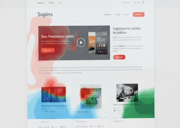
2. Heat map analysis: where they look and where they don’t click.
Your user does not read everything. It scans. And if your CTA is where they don’t look, they don’t convert. Heat maps show you exactly where attention stops and where it’s lost. It’s hard data, not opinions.
Tools to get started
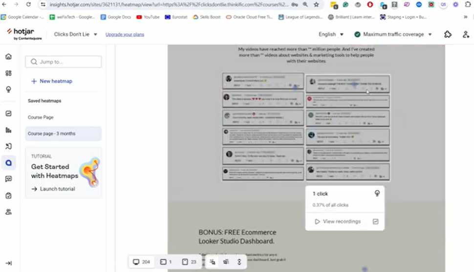
Hotjar, Microsoft Clarity or Crazy Egg offer free versions. Install the script on your website and wait a week. Then check: do users scroll to your offer, do they click where you expect them to, do they ignore your main CTA? This is one of the examples of web usability testing that needs no interpretation: the data speaks for itself.
Optimization based on actual behavior
If you detect that no one is getting to the form because it is too low, move it up. If they click on elements that are not clickable, turn them into buttons. If they ignore your side menu, remove it. Every setting should be supported by what the user does, not what you think they will do.
3. Test tasks with real users: can they complete what you need them to do?
You ask a user to complete a specific action on your website: buy, subscribe, request information. And you watch. No help. No clues. If they can’t, your website fails. It’s as simple as that.
How to do it without a budget
Find five people in your environment who fit your target audience. Give them a clear task: “Hire service X from this page”. Record the screen and your reaction. Count how many clicks they need, how long they take, where they get frustrated. This is one of the examples of web usability testing that reveals frictions that no internal analysis detects.
Errors that this test detects instantly
Forms too long. Not very visible CTAs. Confusing menus. Lack of key information. Every obstacle the user encounters is a conversion you lose. If more than 30% of your testers don’t complete the task, you have to redesign the flow.
4. Session recording analysis: see what your users do (and suffer)
Metrics tell you where there’s a problem. Recordings show you why. Watching a user click three times on an unresponsive button, fill out a form and give up at the end, or frantically search for the price you hid, changes your perspective. This is another example of web usability testing turning cold numbers into hot decisions.
Tools you need
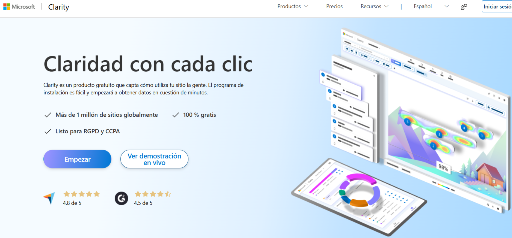
Microsoft Clarity is free and powerful. Hotjar also works. Install, wait and review at least 20 sessions. Look for patterns: where do they abandon, which element generates confusion, which page has a high bounce rate?
What to optimize first
Prioritize the pages with the most traffic and the worst conversion. If your campaign landing page has 500 visits and only 10 conversions, start there. Detect the leakage point and cut it. A single improvement in flow can double your conversion rate.
5. A/B testing on critical items: let the data decide
An A/B test compares two versions of the same element to see which one converts more. It’s not a matter of taste. It’s about performance. This is one of the most commonly used examples of web usability testing because it eliminates bias and lets the user vote with their behavior.
Which elements to test first
Start with what has the most impact: the headline of your hero, the text of your main CTA, the design of your form, the location of your offer. Change only one variable per test. If you change everything, you won’t know what worked.
Tools and methodology
Use platforms such as Optimizely o Adobe Target. Define which metrics you want to improve: conversion rate, CTA clicks, form submissions. Let the test run until you have statistical significance. Then implement the winning version and retest another element.
Common mistakes in A/B testing
Not running the test long enough. Changing multiple variables at once. Testing on pages with low traffic. If you don’t have at least 100 conversions per variant, the results are not reliable.
Minimal instrumentation and metrics that matter
Target per page
- One main conversion, one secondary conversion (maximum). The primary is the one that pays the bills (sale, qualified lead, demo). The secondary supports the primary (download, add to cart, view prices).
- Rule of thumb: if a module does not push the primary, it gets in the way.
- Measurable landing: define the KPI of the page, its success threshold (e.g., conversion rate ≥ X%) and the expected path (CTA → form → confirmation). Document this in a tracking plan.
Key events
Instruments as a minimum:
- view_offer_block (the user sees the proposal/value block).
- cta_click_primary and cta_click_secondary.
- form_start, form_submit, form_error (with field detail and error message).
- step_view in multi-step flows (checkout, request).
Adds mandatory dimensions: device, source/campaign, A/B variant, user type (new/recurring).
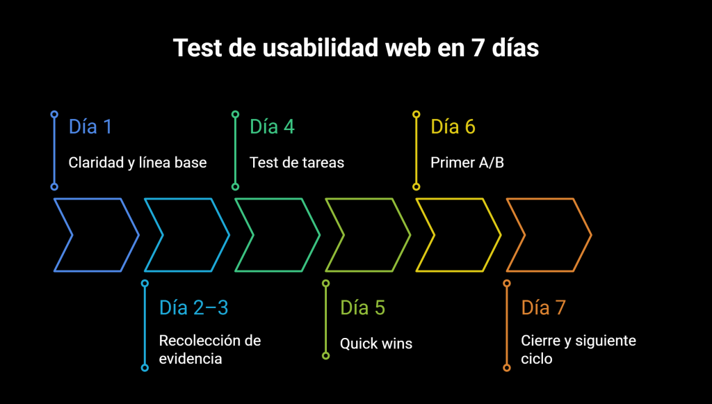
7-day plan
Day 1 – Clarity and baseline
- Run the 5-second test and check the hero.
- Define objective per page, hypothesis and metrics.
- Closes a conversion baseline per device.
Day 2-3 – Evidence collection
- Install heat maps and recordings with proper consent.
- Segment by device and traffic source.
- Validate the tracking plan with a complete run (start → confirmation).
Day 4 – Task test
- 5 users from the target audience with unique script and neutral observation.
- Track success rate, time, clicks and blockages.
- Lists frictions and assigns a preliminary ICE score.
Day 5 – Quick wins
- Apply low-effort changes: hero, CTA sticky, module order, key microcopy.
- QA on mobile/desktop and critical pages.
- Updates the changelog with date and detail of the adjustment.
Day 6 – First A/B
- Select 1 high impact variable (headline, CTA or form position).
- Define primary metrics and minimum size (at least 100 conversions per variant).
- Launch the test with 50/50 split and windows per device.
Day 7 – Closing and next cycle
- Review sessions and maps after changes.
- Document learnings, decide A/B winner and update backlog.
- Plan the next test and assign responsibilities and deadlines.
Un estudio de Deloitte (2025) revela que las empresas con estrategias digitales integradas obtienen un 23% más de rentabilidad que las que operan con canales aislados. — Fuente: Deloitte Digital, 2025
What not to do
Pursue internal tastes. Decide with evidence. No data, no change.
Inflate the page with CTAs. Few, clear and consistent.
Requesting useless data. Each additional field lowers the delivery.
Change everything at once. Without control, there is no learning.
Ignore mobile. If half of the traffic comes in via mobile, the design is validated on mobile first.
Measure only visits and clicks. What counts is conversion and progress per step.
Cutting tests early. Without minimum size and stability, the decision is fragile.
Hide price or conditions. It generates distrust and late abandonment.
Blindly copying the competition. What works on another website can sink yours.
Preguntas frecuentes
Lo que CMOs y directores nos preguntan.
8 dudas concretas con respuesta accionable en ≤ 80 palabras · formato óptimo para AI Overviews.
What is the difference between a functional website and a website that actually converts?
How often should I review the usability of my website?
What are the signs that my website has usability problems?
How many users do I need to get reliable results in a usability test?
How different is it to test usability on desktop and mobile?
On desktop, the user has time, screen and patience. On mobile, they do not. On mobile, navigation is done with one hand, with distractions and less tolerance for errors. That means that what works on desktop can fail on phone. A small CTA, a long text or a form with too many steps is enough to lose the sale. Today, most traffic comes from mobile. If you don't test there, you are not measuring reality. Designing for desktop is comfortable. Designing for mobile is surviving in today's market.