
TL;DR · resumen ejecutivo
¿Qué vas a encontrar en este artículo?
If you keep making blind decisions, the problem is not the market. It’s your information system. The way out starts by creating a dashboard in looker studio that, in seconds, tells you what’s working, what’s holding you back and what you’re going to change today....
If you keep making blind decisions, the problem is not the market. It’s your information system. The way out starts by creating a dashboard in looker studio that, in seconds, tells you what’s working, what’s holding you back and what you’re going to change today.
Según Statista (2025), el mercado global de marketing digital alcanzará los 786.200 millones de dólares en 2026, con un crecimiento interanual del 10,1%. — Fuente: Statista, Digital Marketing Report, 2025
Companies that scale don’t guess. They look at data. And not data buried in Excel sheets that no one reviews: live, visualized, actionable data. That’s a dashboard.
Creating a dashboard in Looker Studio is free, functional and simpler than you’ve made up in your head as an excuse not to do it. This tutorial shows you exactly how to build yours. No unnecessary technicalities. No tasks that don’t work. Just the method to go from intuition to decisions based on real numbers.
If this makes you uncomfortable, close now. If it activates you, read on.
Why you need a dashboard (and why today)
Every decision you make without data is costing you money. Period.
You don’t know which campaigns convert. You don’t know which products stop. You don’t know how much you spend per customer that comes in. And meanwhile, you keep investing in the same thing expecting different results.
Looker Studio is not pretty. It is functional.
Looker Studio (formerly Google Data Studio) converts scattered numbers into useful information. Free of charge. No licenses. No artificial limits that force you to pay as you grow.
Connects with everything you use: Google Analytics, Google Ads, Search Console, spreadsheets, databases. Your metrics flow automatically. No need to export anything manually every week.
Real-time update: you open the dashboard and see what is happening now. Not reports from three weeks ago that are no longer useful.
Controlled access: your team sees what they need to see. Nothing more, nothing less.
Step 1: define which metrics drive your business
Here is the mistake that 90% of those who create dashboards make: putting in as many metrics as possible “just in case”. The result is a cluttered dashboard that nobody looks at because nobody understands what to do with it.
The only metrics that matter
Before you open Looker Studio, answer this: what three numbers do you need to check every Monday to know if your business is moving forward or backward?
If you are a marketing manager: conversions, cost per acquisition, ROI of campaigns. If you have
Limit yourself to 5-8 key metrics. The rest is noise.
Organize your data before connecting
If your data is cluttered, your dashboard will be useless. Check your source:
- Google Sheets: no empty rows. Clear headings in the first row. Dates in consistent format.
- Google Analytics: verify that the tracking is working and that you have the correct permissions.
- Databases: make sure you can connect them from Looker Studio.
Create a test sheet with sample data if it is your first dashboard. Experiment without fear of breaking anything.
Step 2: connect your first data source
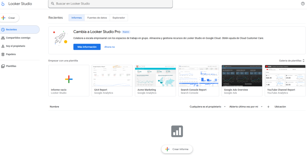
Go to Looker Studio and sign in with your Google account.
Create the project
Click on “Create” → “Report”. It will ask you if you want to use a template. Start from scratch. Templates limit your learning and do not fit what you really need.
You will see a blank canvas. At the top is the toolbar. There you build everything.
Connect data in 3 steps
As soon as you create the report, Looker Studio asks you for the data source.
Step 1: find the connector you need. For this tutorial we will use Google Sheets because it is the most straightforward. If you have Google Analytics configured, connect it directly.
Step 2: authorize access (first time) and select your Analytics spreadsheet or property.
Step 3: Looker Studio automatically detects your columns and assigns data types. Check that the dates are “Date”, the numbers “Metric” and the text “Dimension”. If something is wrong, change it now.
There is no turning back once you start building. Set it up right from the start.
Step 3: design to make decisions, not to decorate
A pretty dashboard that no one uses is a useless dashboard. Design it so your team can find the information they need in less than 5 seconds.
Visual hierarchy dictates what you look at first
Eyes read in a Z-shape: top left → top right → bottom left → bottom right.
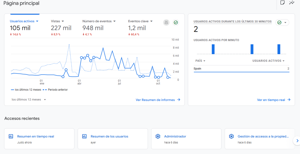
Above: your critical KPIs. The number that defines whether the month is going well or badly. Total sales. Conversions. Margin.
Medium: time trend graphs. How your main metric evolves week by week.
Below: detailed tables. Granular data for those who need to go deeper.
Add your first metric: KPI card
In the top bar: “Add a chart” → “Scorecard”.
Drag a rectangle in the upper area. A card with a number will appear.
In the right panel you configure which metrics to show. If you connected Google Analytics: “Users”. If you use sales sheets: sum of “Revenue”.
Customize color, font size, and title. “Sales October 2025” is useful. A number without context says nothing.
Create 3-4 more cards with your key metrics. All at the top. All visible without scrolling.
Step 4: build visualizations that don’t lie
A poorly chosen graphic confuses more than it helps. Here’s how to select the right one depending on what you need to see.
Line graphs: to view trends
Are your sales up or down? Did the October campaign outperform September?
“Add chart” → “Time series”. Configure your time dimension (Date) and metric (Sales, Leads, Revenue).
Looker Studio groups by day. Change it to week or month if you prefer a macro view without daily noise.
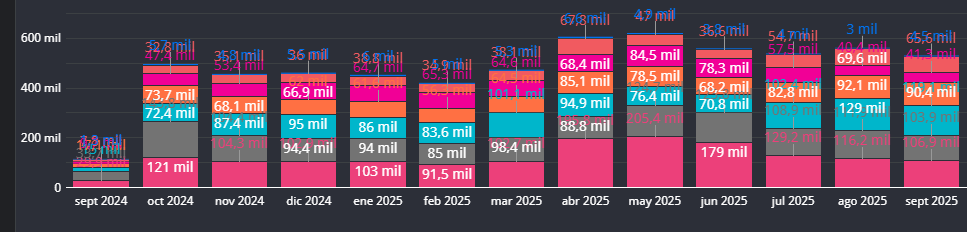
Bar charts: to compare categories
Which product sells the most? Which channel brings in the most customers? Which campaign has the best ROI?
“Add chart” → “Bar chart”. Dimension = category (Product, Channel, Campaign). Metric = what you measure (Sales, Conversions, Clicks).
Order from highest to lowest. You identify the winners in 2 seconds.
Tables: when you need the exact detail
Sometimes you need the raw numbers. The tables in Looker Studio are interactive: you sort columns with a click.
“Add chart” → “Table”. Include 4-6 columns maximum. More than that is unreadable.
Example: Product | Units Sold | Revenue | Margin. Nothing else.
Step 5: add filters to explore without limits
A static dashboard shows you a picture. A filtered dashboard lets you query your data.
Date control: the most important filter
“Add a control” → “Date range dropdown”.
Place it at the top, clearly visible. Your computer switches between “Last 7 days”, “This month”, “Current quarter” with a click. All graphs are automatically updated.
Without this, your dashboard is dead.
Filters by dimensions
Do you want to filter by product, by region, by campaign?
“Add control” → “Drop-down list”. Configure the dimension you need to filter.
Combine filters: date + product + region. Make specific analyses without creating 20 different dashboards.

Step 6: functional design
Your dashboard should look professional. But professional doesn’t mean cluttered. It means clear, clean, useful.
Consistent color palette
“Theme and design” in the top menu. Define your corporate colors if you have them. If not, use a simple palette: one color for positive data, another for negative, gray for neutral.
Use saturated colors only to highlight the critical. The rest in soft tones.
Consistency in all elements
If a bar chart is blue, all bar charts are blue. If titles are Arial 14, all titles are Arial 14.
Set “default styles” at the beginning. It saves you formatting each element one by one.
There is no excuse for a dashboard that looks like it was made by five different people.
Step 7: share with the correct permissions
You’ve built your dashboard. Now you need to get it to who needs it. With the right access.
Three levels of access
Share” button at the top right:
- Visualizer: just view the dashboard and interact with filters. For executives, managers, customers.
- Editor: you can modify design, add graphics, change settings. For your analysis team.
- Owner: total control. For you and for those who really should have it.
Don’t give editor access to those who only need to see numbers.
Automatic email delivery
“File” → “Schedule e-mail sending”.
Configure frequency (daily, weekly, monthly) and time. Your team receives a PDF of the dashboard without asking for it.
Perfect for executive reports that no one has time to go looking for.

Un estudio de Deloitte (2025) revela que las empresas con estrategias digitales integradas obtienen un 23% más de rentabilidad que las que operan con canales aislados. — Fuente: Deloitte Digital, 2025
Mistakes that kill dashboards (and how not to make them)
Mistake #1: saturate with 50 metrics “just in case”.
A dashboard with everything on it is a dashboard that no one uses. If you have more than 12 views on a page, you are drowning your audience.
Solution: create multiple pages within the same report. Page 1: executive summary (5 KPIs). Page 2: product analysis. Page 3: campaign analysis. You navigate between them with the top menu.
Pitfall #2: Stagnant data
A dashboard with information from a month ago is a dead letter. If your data does not update itself, the dashboard dies in two weeks.
Solution: connect sources that update automatically (Analytics, Ads, BigQuery). If you use Google Sheets, set up automatic refresh scripts. Looker Studio refreshes the data every time someone opens the report.
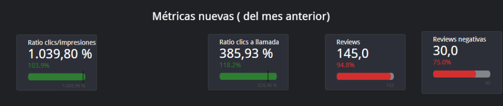
Error #3: numbers without context
“1,200 sales” means nothing. Is it good? Is it bad? Is it up or down?
Solution: Use calculated fields to show variations. Add “Sales previous month” and show the percentage change. A number with comparison is information. A number is just noise.
Mistake #4: Changing definitions
“Lead”, “customer” or “order” mean different things depending on who is looking at it and the discussion never ends.
How to fix it: create a glossary within the report with definitions and formulas. Lock names and rules; this avoids interpretation wars.
Mistake #5: design that gets in the way
Loud colors, small fonts and glued elements create noise and fatigue.
How to fix it: use a simple grid, clear visual hierarchy (KPIs at the top, trends in the middle, detail at the bottom) and a consistent short palette. White space is clarity.
Mistake #6: Incorrectly placed filters
Without useful filters, analysis becomes slow; with confusing filters, results change without anyone knowing.
How to fix it: place the date range at the top and 2-3 key filters (channel, product, country). Document what affects each filter and disable the ones that do not contribute.
Preguntas frecuentes
Lo que CMOs y directores nos preguntan.
8 dudas concretas con respuesta accionable en ≤ 80 palabras · formato óptimo para AI Overviews.