How can I optimize my website for mobile?
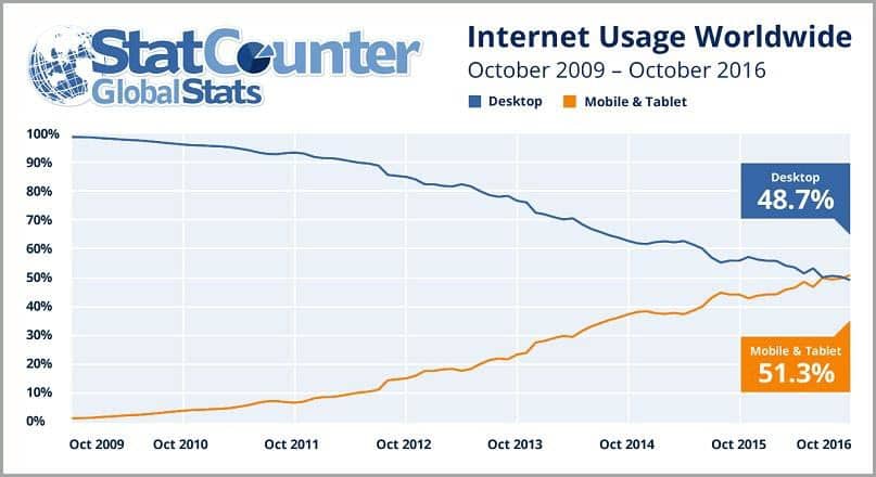
The rapid development of mobile devices over the last ten years has greatly changed the online landscape. According to statistics found by StatCounter Global Stats, internet usage on mobile and tablets as of 2016 surpassed desktop usage worldwide.
The main reason for using mobile devices is, of course, their convenience: they are always within reach and are often cheaper than computers.
However, not all mobile users are action-oriented searchers. Some mobile users are just trying to be entertained or stay informed. But for the purposes of this post, we’ll focus on mobile device users who are ready to take an action that translates into sales for your digital business.
The Google Mobile Movement Study claims that 9 out of 10 searchers have taken action as a result of a smartphone search. 95% of mobile users are looking for local information and a large number of them are ready to buy.
Smartphone users perform different actions after accessing content that can significantly influence business owners’ revenue.
Looking at the above statistics, it is clear that a business owner with a digital presence must create the right conditions to meet the needs of a mobile user (and close the sale).
As a business owner you must tell yourself: “I have to optimize my website for mobile and adjust to the requirements of users in order not to be left behind”.
If you have not yet started optimizing your website for mobile, you should do it right away!
Customers searching for products online expect a seamless experience, and their expectations extend to a seamless mobile web experience.
As the mobile web evolves, we’ve spotted five easy-to-implement ways to maximize your website’s appeal to mobile users and consequently increase traffic coming from smartphones.
1. Your website must be 100% responsive
When trying to answer “how can I optimize my website for mobile”, we need to talk about web design optimized for mobile devices that adapts perfectly to the size of any device.
Delivers a proper user experience and web design and adjusts content to fit the screen perfectly.
As a result, visitors to your website can access all content from their mobile devices without the need to zoom in or out or scroll sideways.
Your needs are met as efficiently as they would be on a desktop or home or office computer.
Responsiveness is an important factor when it comes to ranking high in organic search results like Google. If your potential mobile customers use search engines (and they do), you should be very interested in ranking high in the results.
In 2015, Google announced that it would begin rewarding responsive websites to encourage multi-device compatibility. Since then, responsive web development has become Google’s recommended approach to mobile web design.
It also saves precious time when it comes to optimizing my website for mobile. It is much easier and cheaper to update a website than to have a separate mobile version.
2. Join the AMP movement
It is no secret that the decisive factor when it comes to bounce rate is the speed at which a website loads. According to Kissmetrics, 40% of web users will abandon a page if it takes more than three seconds to load.
The Accelerated Mobile Pages Project (AMP) is a Google-backed initiative that increases the speed of websites on mobile devices; in other words, it makes pages load faster. When introducing the AMP Project on its blog in 2015, Google said that the main goal of AMP was to improve the performance and potential of the mobile web.
“Every time a web page takes too long to load, companies lose a reader, and the opportunity to earn revenue through advertising or subscriptions…. We want web pages with rich content such as videos, animations and graphics to work together with intelligent ads and load instantly. We also want the same code to work across multiple platforms and devices so that content can appear everywhere in an instant, no matter what type of phone, tablet or mobile device you are using.”
The AMP framework is open source, available to everyone, and completely free. There is an AMP cache URL format to follow, and all AMP-optimized websites are distinguished with a small lightning bolt representing their ultra-fast load time.
Google surveys have shown that websites built with AMP load 15-85% faster than non-AMP versions on mobile devices. In February 2016, Google officially integrated AMP listings into its mobile search results.
So, if you want instant loading, higher conversions, refined ADS impact and an open source framework, you should consider joining the AMP movement to optimize my website for mobile.
3. Uses usability best practices
A website that is confusing to navigate is never attractive to mobile users. When they don’t know where to click or can’t find what they need, they are unlikely to become customers.
Focus on ensuring that your web design is simple and optimized, and that it has as a priority to create a good user experience.
It is best to adapt your web design so that key information is visible without too much scrolling and that all key information is available on the home page.
Think about the context in which mobile users are coming to your website. People using their cell phones are generally on the move or about to be on the move. They don’t have time to surf the web as they would if they were at a desk and are often anxious to find an immediate solution.
That’s why your mission is to provide mobile users with a website that is easy to navigate and difficult to judge, in short with good usability.
The main tool they will use when dealing with your website is their fingertips, so try to keep all clickable elements (buttons, links, etc.) at a well-defined distance from each other. The space between them will allow your users to comfortably navigate through the web.
Tactile design: we must provide options through drop-down menus to negate the need for unnecessary typing. Typing on a mobile device is time-consuming and less comfortable than typing on a computer keyboard, so we need to make it as easy as possible for mobile users to navigate our products and services.
If you can, incorporate tactile elements into your navigation; this basically involves a color change, text highlighting or other visual cue to reassure mobile users that they have selected the correct option.
4. Use email marketing campaigns to combat cart abandonment or “Churn Rate”.
Did you know that 69.23% of shopping carts are abandoned before a customer completes a sale? But this doesn’t always happen because the customer doesn’t want to buy your products. Sometimes, it happens because they are viewing your products from a cell phone and get distracted, or intend to return to the website later.
Avoid this problem by implementing an email marketing campaign to combat shopping cart abandonment.
When mobile users leave items in the cart, try to incentivize their purchase later (and from any device) by sending them a personalized email, preferably one that includes links to relevant products and special offers.
It is advisable to not only insert a ’email my shopping cart’ button for them to use, but to mention that if they email their shopping list to themselves, they will receive special offers. More than half of the cart recovery emails are opened and more than a third of them end up generating purchases.
Using an email campaign to combat shopping cart abandonment also helps solve the problem of customers who prefer to seek advice from family members, spouses or friends before completing a transaction or simply prefer to shop from their computers.
5. Take advantage of social media marketing
It is well known that millions of people actively use social networks around the world. Social networks rank second in terms of mobile traffic volume, with only a few search engines ahead.
Consequently, it’s a good idea to use social media marketing to make your mobile web traffic skyrocket.
Don’t be shy about promoting your website on social media profiles: if you want to increase your number of potential customers, you must take steps to make it easy for them to find you. Make sure all your social media accounts include mobile URLs so users can click and bookmark for future visits at a later date.
It goes without saying that you should have “Like” and “share” buttons on key pages, and that you should install plugins that link to all your relevant social media accounts.
In a nutshell
It is well worth investing time in optimizing my website for mobile to improve engagement and increase sales. In today’s digital environment, it is essential.
The above tips will help you not only capture the attention of smartphone users, but also encourage them to return to your website again and again.
There are many more steps you can take, including using advanced mobile analytics to learn from user behavior. However, the five tips I have listed above are an excellent starting point and definitely by applying them, you will achieve steady growth in mobile traffic.
Don’t waste your valuable time: Start optimizing your website for mobile users right now! By increasing the number of users from mobile devices, you will greatly improve your earnings. If you don’t know where to start, at Cronuts.digital we can help you offer the best mobile experience your users can imagine.


