A well-structured navigation system is crucial for providing users with a seamless and intuitive browsing experience. At the heart of this system lies the
Navbar, a fundamental component that ensures users can easily access the different sections of a website.
At
Cronuts Digital, we delve into the concept of the
Navbar, its importance, best practices, and the latest trends in designing effective navigation bars. Are you ready to discover its power?
What is a Navbar?
A
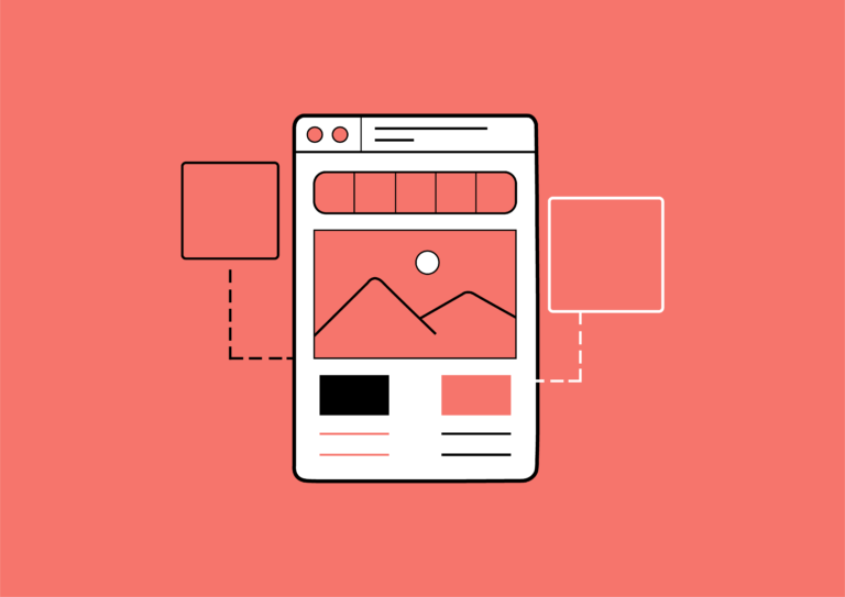
Navbar, short for “navigation bar,” is a user interface element that contains links to the main sections of a website. Typically positioned at the top of the page, it serves as a guide for users to navigate through the site’s content. While the Navbar is commonly horizontal and situated at the top of the page, it can also be vertical, appearing on the side of the page, or even hidden and revealed through interactive elements like hamburger menus.
The importance of a well-designed Navbar
Its significance extends beyond mere aesthetics or layout; a well-designed Navbar plays a crucial role in various aspects of a website’s performance and user satisfaction. Here’s a deeper look into why a thoughtfully crafted Navbar is essential:
1. Enhancing User Experience (UX)
Navigational efficiency: a well-organized Navbar directly contributes to a smoother user experience by allowing visitors to find what they need quickly and effortlessly. When users can intuitively locate key sections like products, services, or contact information, they are more likely to stay engaged with the site and complete desired actions, whether it’s making a purchase or getting in touch with the business.
Reducing frustration: clear and concise navigation minimizes user frustration. If users struggle to find information, they may leave the site in search of a better experience elsewhere. A well-designed Navbar helps in reducing this risk by providing a clear path to relevant content, thereby improving user retention and satisfaction.
2. Improving navigation efficiency
Logical organization: the Navbar serves as a roadmap for users, outlining the structure of the site and guiding them through its content. By organizing links logically and hierarchically, designers ensure that users can easily navigate between different sections and sub-sections. This logical flow is crucial for sites with extensive content or complex structures, as it simplifies the user journey and enhances accessibility.
Ease of access: effective Navbars ensure that important links are placed prominently. For instance, placing primary sections such as “Home,” “About Us,” and “Contact” in easily accessible positions helps users find these critical areas without unnecessary clicks or searches.
3. Strengthening brand identity
Visual representation: the Navbar is often one of the first elements users encounter on a website. As such, it provides a prime opportunity to reinforce the brand’s identity through design elements like colors, fonts, and logo placement. A well-designed Navbar can reflect the brand’s personality, values, and visual style, creating a cohesive and memorable user experience.
Consistency across pages: maintaining a consistent Navbar design across all pages helps in reinforcing brand recognition and trust. Users become familiar with the layout and design elements, which contributes to a more cohesive and professional appearance.
4. Ensuring responsive and accessible design
Mobile-friendliness: in an era where mobile traffic accounts for a significant portion of web visits, having a responsive Navbar that adapts to various screen sizes is essential. Mobile-friendly Navbars, often utilizing collapsible or hamburger menu designs, ensure that navigation remains functional and accessible on smaller devices without compromising usability.
Accessibility considerations: a well-designed Navbar also takes accessibility into account, ensuring that it is usable by individuals with disabilities. This includes considerations such as keyboard navigation, screen reader compatibility, and sufficient color contrast to aid users with visual impairments.
5. Facilitating content discovery
Search integration: for websites with extensive content, integrating a search bar within or near the Navbar can significantly enhance user experience by allowing visitors to quickly locate specific information. This is particularly valuable for e-commerce sites, blogs, or knowledge bases where users may have specific queries or interests.
Highlighting key areas: The Navbar can be used strategically to highlight key areas of the site, such as promotions, new arrivals, or featured content. By drawing attention to these elements, the Navbar can guide users to important or timely information, enhancing engagement and driving conversions.
6. Supporting brand goals and marketing
Promotional opportunities: the Navbar can be leveraged as a space for promotional banners or calls-to-action, such as limited-time offers, special events, or subscription prompts. This integration of marketing elements helps drive user engagement and conversions while maintaining a cohesive navigational structure.
User personalization: advanced Navbars can incorporate personalized elements based on user behavior or preferences, offering a customized experience that aligns with individual user interests. This personalization can increase user satisfaction and loyalty by providing relevant content and navigation options.
Best practices for designing an effective Navbar
By following best practices in Navbar design, you can enhance user experience, improve site usability, and strengthen your brand. Here’s a comprehensive guide to the best practices for creating an effective Navbar:
1. Prioritize clarity and simplicity
Use descriptive labels: ensure that the labels on your Navbar are clear and descriptive. Avoid jargon or ambiguous terms and use straightforward language that accurately describes the content or functionality of each link.
Limit menu items: aim to keep the Navbar simple by limiting the number of primary links to a manageable amount. Typically, five to seven key items are ideal. Too many options can overwhelm users and make navigation confusing.
Group related items: organize links into logical groups or categories. For example, group all product-related links under a “Products” menu and all support-related links under a “Support” menu. This organization helps users find what they’re looking for more efficiently.
2. Ensure consistent layout and design
Consistency across pages: maintain a consistent Navbar layout across all pages of the website. This consistency helps users feel oriented and familiar with the navigation structure, which reduces confusion and improves usability.
Visual hierarchy: use visual hierarchy to highlight the most important links. You can achieve this through size, color, or font weight. Make key navigation items stand out to ensure that users can easily access the most critical sections.
Responsive design: design the Navbar to be responsive and adapt to various screen sizes and devices. Ensure that it functions well on desktops, tablets, and smartphones. On mobile devices, consider using a collapsible menu or a hamburger icon to save space and enhance usability.
3. Focus on User Experience (UX)
Accessible navigation: ensure that your Navbar is accessible to all users, including those with disabilities. Implement keyboard navigation, provide alternative text for icons, and use sufficient color contrast to improve readability for users with visual impairments.
Interactive elements: incorporate interactive elements like hover effects or animations to provide feedback and enhance user interaction. These elements should be subtle and enhance usability without causing distraction or slowing down navigation.
Search functionality: for larger websites, consider integrating a search bar within or near the Navbar. This allows users to quickly find specific content without having to navigate through multiple pages or menus.
4. Optimize for performance
Minimize load time: ensure that the Navbar does not negatively impact the site’s load time. Optimize images and icons, and use efficient coding practices to keep the Navbar lightweight and fast-loading.
Test across browsers: test the Navbar across different web browsers and devices to ensure consistent performance and appearance. This helps identify and resolve any compatibility issues that could affect user experience.
Monitor user interaction: use analytics tools to track how users interact with the Navbar. This data can provide insights into which links are most popular and how users navigate the site, allowing you to make informed improvements.
5. Incorporate branding and design elements
Reflect brand identity: use design elements that reflect your brand’s identity, such as colors, typography, and logos. This helps reinforce brand recognition and creates a cohesive visual experience throughout the site.
Customizable design: while maintaining brand consistency, allow for flexibility in design to accommodate different types of content or special features. For example, you might include promotional banners or notifications in the Navbar for special events or offers.
6. Implement advanced features wisely
Mega menus: for websites with extensive content, consider using mega menus to display a large number of links and subcategories in an organized manner. This feature can help users navigate complex sites more easily.
Sticky or fixed Navbar: a sticky or fixed Navbar remains visible as users scroll down the page, providing constant access to navigation links. This feature can enhance usability, especially for long pages or sites with a lot of content.
Dropdown menus: use dropdown menus to reveal additional options or subcategories. Ensure that these menus are easy to navigate and don’t obscure important content on the page.
7. Regularly review and update
Evaluate user feedback: gather and analyze user feedback to identify any issues or areas for improvement in the Navbar. Regularly review the Navbar’s performance and make adjustments based on user needs and preferences.
Update content: keep the Navbar up-to-date with current content and offerings. Regularly review and update the links to ensure they reflect the latest information and changes on the website.
Adapt to trends: stay informed about design trends and best practices to keep your Navbar modern and effective. Implementing new features or design elements can enhance user experience and keep the site fresh and engaging.
Latest trends in designing an effective Navbar
Modern Navbar design is evolving with a focus on enhancing user experience and visual appeal. Minimalist design remains popular, emphasizing simplicity with clean layouts and limited menu items to avoid clutter. Sticky or fixed Navbars are increasingly common, allowing continuous access as users scroll through long pages. Hamburger menus, which collapse into a three-line icon, optimize screen space and maintain a tidy interface, while mega menus provide comprehensive navigation options for sites with extensive content.
Interactive and dynamic elements, such as microinteractions and animated transitions, are becoming standard to engage users and make navigation more intuitive. Personalization features, which tailor the Navbar based on user behavior or preferences, and integrated search functionalities with autocomplete enhance usability. Additionally, voice and gesture navigation are emerging trends, offering hands-free and touch-based interactions, further improving accessibility and convenience.
Navigating success: the important role of well-designed Navbar
Navbar role extends beyond simple navigation, influencing user satisfaction, brand identity, and overall site functionality. By implementing best practices such as clarity, consistency, and responsiveness, you can significantly enhance user engagement and ease of use. Additionally, staying abreast of the latest design trends—such as minimalist aesthetics, sticky menus, and personalized elements—ensures that your Navbar remains effective and modern.
At
Cronuts Digital, we emphasize the importance of these design principles and trends to help you create a Navbar that not only guides users effortlessly but also reinforces your brand’s presence. Embrace these insights to elevate your website’s navigation and provide an exceptional user experience.


